
Unveiling Our New Brand Identity: The Story Behind CIS Agency's Logo Redesign
- CIS Agency
- Mar 20, 2024
- 2 min read
Updated: Dec 20, 2024

At CIS Agency we are constantly evolving. As a result, we decided this was the right time to make a change in our own corporate image. The new logo is actually a redesign of the original image, which we considered elemental to retain the essence of the previous logo.
Below we explain the concepts and symbolisms that function as the base in the creation of what will now be the new branding of CIS Agency.

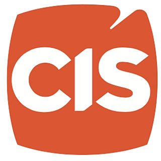
Essential Element. The essential element of the previous logo is a square in orange color, containing the acronym "CIS." This is why, for the new logo, we decided to keep this element but with modifications that bring greater meaning and originality.
Curved edges. The edges of the square have a curved shape that extends the four directions of each line which represents expansion, an important concept for a company in constant growth.
Acronym CIS (teamwork). The acronyms are preserved within the square but with a more vigorous appearance that projects integrity and presence. The diagonal cuts in the letters "s" and "c" coincide with the cuts in the letter "I", which speaks of the good coordination between the team in the United States and abroad.
AGENCY. The word "agency" replaces the old name and brings a more modern style and trend to the brand as well as a prestige status. The typography chosen for this word is clean, highly readable and placed in a suitable proportion and color to be noticed as part of the logo but without detracting from the orange square that acts as a primordial element.
Final point. The orange dot at the end of the word "agency" is an element that helps to integrate the entire logo in one piece, which means unity and force.
Diagonal cut in the square. The square has a diagonal cut on the top that carries a deeper meaning. CIS is a bicultural team that blends both Latino and American influences. With the owner's Hispanic background, we wanted to incorporate an element that reflects the Latin roots of our company, celebrating this unique cultural combination. The diagonal cut starts from the idea of integrating an accent or "tilde" which in turn is representative of the Latin alphabet. This cut, in addition to representing the Latin part of the team, adds concepts of originality and flexibility.

The new CIS Agency logo presents a minimalist style, a fresh image
that projects MODERNISM and INNOVATION.


Your Brand is vital to your success! It’s how you are perceived by your customers (excellent or poor). The reputation and performance of your business are essential to create name recognition and product loyalty, especially when consumers are heavily relying on easily accessible personal reviews via social media. This is quite simple - branding is your whole package in everything the customer sees, feels, touches, and how they interact with you. CIS Agency and our expert team of consultants will give you the tools you need to improve and maintain an excellent corporate identity.
Call or email us today at 616.347.6300 or service@wearecis.com and let us help with your brand!


Comments